
What does it mean to have a website with an adaptive, responsive or responsive design?
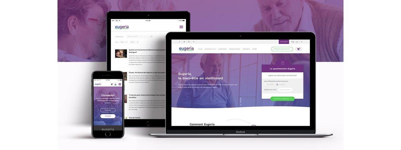
These days, Responsive Web Design (RWD) has become a real phenomenon, especially when it comes to web design projects.
This notion, now a must, appeared for the very first time in May 2010 in an article by Ethan Marcotte: A List Apart. It then highlights the fact that we use our mobiles more and more. For this reason, he believes we should think about creating a “flexible foundation” or “responsive architecture”. This would enable users to comfortably visit a website on their smartphone.
Ethan predicted it: in 2018 in Canada, 26.1 million people used the Internet on their cell phones. This makes responsive web design a real asset. No need for a dedicated site: a version for every device (computer, mobile, tablet), responsive design is multiplatform!
Its main objective is to automatically adapt to the screen resolution of any type of device. This is done with complete transparency, guaranteeing users optimal browsing on any medium. A website with a responsive or adaptive design makes for a more comfortable user experience!
How does it work?

Designed by freepik.com
The pages and content blocks (text and images) of an adaptive and responsive website will automatically resize, reorganize and crop themselves according to the size of the screen being used.
In more technical terms, it’s the site’s liquid design combined with CSS3 Media Queries methods that will modify, or rather, reorganize the page, preventing content from “spilling over”.
Last but not least, responsive web design offers the possibility of showcasing the website’s content, which is more important on mobile devices (than on computers). Once again, this will optimize the user experience on the site.
Good to know!
During a mobile search, Google favors the referencing of “mobile friendly” websites. As a result, responsive websites will move up the results pages in mobile searches.
So why don’t you take the mobile optimization test: it’s over here!